Search This Blog

Sunday, October 30, 2011

end or a new begin? (Final Post, 8th)

It is time to wrap up with the design project, but it is definitely a great way to start my study in Information area. Because this project is not only closely tight to all the content that we have learned in class but also related to our own interest, which makes this project fun and educational.
My idea is about art and design. I want to have a design company which provides graphic design, such as logo and interior design; we also offer any other kind of design with manufacture, for example, we help people to improve their own design on their own projects and product those design for customers (personalized key chain, chair, closet, clothes and more). In addition to those, we would create our own design software, application for mobile device (and cloud computing) for our customers to have access to design on their own. The blog is mainly used for commercial purpose. Different blog posts are connected with design in different ways, in order to get more people interested and motivated in design.
It is a very unrealistic idea for a freshman in college to achieve. However as I was writing more posts and we were learning more information in class, my vision on this company idea becomes more clear. I clarified the “privacy policy” (week 2) of the company; I did research on “how to reuse old components of computers” (week 3) and “Linux” (week 6); I explored on “how to draw with excel” (week 2), “how to beautify QR code” (week 4), and “the fashion of 8-bit effect” (week 5). I also looked into a professional blog of design (week 7), and found out the similarities and differences between my own blog and the professional blog. I learned to use new software, experienced different operating system, created new art works, and improved my blogging skill. I learned lots of things on information studies and design at the same time.
The blog project is almost done, but it inspired me that no matter what you do you can make it interesting and relate to your interests. And information is the tendency of the world, just like professor Jeff Rubin said in the first class, no matter what you like to do, you can use your knowledge of information studies to do it better. Even though the project is done, the idea that I have worked on has imbedded in my mind.

Those are the results after I read through other people's passions!

http://imanentrepenuar.blogspot.com/2011/10/seth-gobins-blog.html?showComment=1319783659843#c281175170245922854
http://lana-gorgeousgarments.blogspot.com/2011/10/unix-in-gorgeous-garments.html?showComment=1319785538072#c8086404714227543970
http://momshangoverhelper.blogspot.com/2011/10/week-5-mixing-it-up.html?showComment=1320006167431#c7162830274805140599

Happy Halloween!!


Monday, October 24, 2011

comment on a professional design blog (7th)

I looked over couple of professional design blogs. There are two different kinds of them, one is based on the designer who is also the blogger, which he/she would write all his/her thoughts and passions about the design that he/she understands; another is depended on the focus of different topic of design, for example, logo design love, I love typography, and graphic define magazine. I looked deeply into this blog which names Quipsologies. This blog is broader in topics, just like mine. This blog posts are contributed by different people, so that this blog has all kinds of design, graphic, fashion, furniture. Quipsologies is a great inspiration of any kinds of design, and it also leads you to lots of other great blogs.
The way that this blog participate in design world is spontaneous; there are no limits to the form or type of its information, as long as it is related to art. It also performs in different type of information, but mainly pictures and videos with explanation. My Blog runs in the same way, I would put up any inspirations as long as they are about design.  I like to present all my posts with something more visual then just letters, which I believe will give people better impressions and it is easier for people to remember since design a type of is visual art.
 However, this blog is more advanced than mine because it has details that interests more people and help people understand the blog better. First of all, this blog has a clear content of all blog posts. It has a clear form of its content. The left had part is the number of the blog posts and brief explanation, and the right hand is a picture which represents the post. Which makes it more clearly about each posts, I should probably improve my blog on people’s first impression of my posts. Another interesting thing is that this blog has a little section of quiz next to the main post menu, which would interests more people and helps people understand themselves better in addition to just inspire them. Thirdly, this blog has projects that are related to design and readers can get to know and perhaps participate in them.  The second two details I think I can work out somehow and fit it into my entrepreneurial ideas, which can help both the company and my costumes. For example, the quiz I can make it more personalized so that I can also collects the data of demand in design market. And I can always discover human resources for the company from different projects that I post.
Improvement is a consistent process for a blog, and look into professional blogs helps to improve our own blogs.

Monday, October 17, 2011

Graphic design with Linux. (6th)

As a less visual OS-- Linux, how well can it do graphic design? The answer you will need to discover yourself. First, let me introduce some free software to you.


K3DSurf(http://k3dsurf.sourceforge.net/) -  KPovModeler is POV Ray maker, which runs on the Linux and that allows users to drag shapes over in three view boxes. Making use of this, users will very easily set placement. Because of its cost effectiveness it is more preferred in web servers than other operating system. 


GIMP (www.gimp.org) - an excellent graphics tool, especially with the new version 2.2 which offers previews of filter effects. It supports just about every feature you could want, including layers, filters, scriptability, good handling of large files, and so on. It is pretty similar to Photoshop when it comes to operate.   


Scribus (http://www.scribus.org.uk/) - a document layout tool. Great for small projects, but I've heard that it doesn't scale up well. 


Comic Life (http://plasq.com/products/comiclife/win) - a comic desktop publishing computer program developed by plasq for Mac OS X and Windows. It also has Linux version, but it doesn't work as well. 


OpenOffice.org (www.openoffice.org) - standard office software. Tends to have slightly different features to MS Office, but it's certainly no less featured.


LaTeX (http://www.latex-project.org/) - LaTeX is an extremely high quality typesetting tool, mainly used to setting scientific documents (but, of course, can be used for almost anything). It's not a WYSIWYG tool (for that, you need to add Lyx from http://www.lyx.org/) and not something you can expect to just sit down and use, but the results that you get for a little effort are certainly far better than any WYSIWYG tool I've ever seen.


One big advantage is that Linux OS is more Flexible.The Linux Kernel’s support for modules is one of the most interesting features of the Linux system. The module can be put in or take out from the kernel, while it is in the running process. You can move for the online to get more information about graphic design for Linux systems.  You can also get in formation about troubleshoot if you face any problems in using Linux. However there are  no professional software exists on the platform yet. So Windows and Mac seem are better OS than Linux on graphic design area. 


Saturday, October 8, 2011

expand our 8-BIT life! (5th)

Do you still remember the days that we play 8-bits Mario with a Nintendo Entertainment System? Do you remember when old DVD got stuck, and the pictures turns into little squares(I hated that)? Nowadays, you have almost everything in high resolution. And 8-bit seems to become a antique. However, antique could become fashion again! Let's bring this abstract art of many colored squares back to our life again!!

Cartoon Yourself!
Do you see that on the sidebar ads of almost every websites? o well, after a minute you will know how to make yourself into a 8-bit cartoon. I mentioned that how to draw with Excel in my earlier blog post. (Please go check out that post as well!! http://lydiaxnc.blogspot.com/2011/09/draw-with-excel-2nd.html)Excel doesn't seem like a perfect tool when it comes to make high resolution pictures, because you need to color your pictures one pixel by one pixel when it comes to details. However it is perfect for this!!!
This is a example! In case you can't tell, that is me eating Pringles potato chips. It isn't as good, but you can do it better by making the "pixels" smaller! 

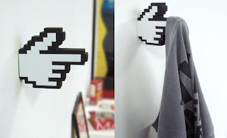
Besides graphic design, let's bring 8-bit to life. By basically putting your graphic design on a shirt. Or design more.? 
in Real Life 

 Also, let's check what was on the fashion show!

Again, Excel is an awesome tool to do those design!!

At last, let me teach you how to make a 8-bit costumes. IT'S ALMOST HALLOWEEN! Yay!
Draw the graphic graph of yourself!! Then let's start working. 
You need foam cubes, card board, glue, spray paint, scissors.
First, you make general shape of your body with the card board. 
Second, separate your foam cubes into different color groups according to the different part of costume, and spray the color on!!  
Third, glue colored foam cubes on to the costumes. 

You are good to go trick 'r treat, now. Haha.

one more suggestion, just for ART and FUN 
Here is an inspiration " Re-things Pix-elated 3D Sculptures ", it is really cool, check it out!

[Supported by Google image and Kiel Johnson and Klai Brown's project]


Monday, October 3, 2011

make your QR code BEAUTIFUL!!(4th)

I have to say that QR code is "attractive" to me. The abstract art which contains in it is very impressive. However, after you look at the black an white, sharp edged QR codes for too long, don't you wish to be a more unique QR code? Don't you want your QR codes stand out from others'? Don't you want a QR code like this?

1. Color you QR code!
It is recognized by the shape of QR code, so matter how crazy your QR code color is, it would work! Color your QR code into your favorite color! Color it into as many color as you want! Or "color" it base on a picture. Set a background picture of whatever you would like it to be, and carve out the shape of your QR code! (either black part or white! Relief or intaglio.)

2. Soften the edges!
The edge doesn't need to be sharp. Soften it. Aesthetically change the expression that normal QR code gives you!

3. What about 3D? 
Did you watch 3D smurf? How much cuter were those smurfs in 3D than when original ones? Make your QR code cuter as well.

or actually 3D?

4. Expand it! 
Make it more than one! What do I mean? i mean double it!! Treble! Or more. 

However when you do that, be aware of the following!Keep one of those QR codes clear by the edge. 

5. It auto corrects errors within 30%!!!
So go ahead do whatever in those 30%. Draw a picture, add a logo, write a quote; it is all up to you! 


6. Blend it in!
Put it into a big picture and get more attention!! 

7. Last tip! Put it into any angle you wish to!!
(this one is my favo so far! Great creativity. Scan it and check out their website, they have more!)


What are you waiting for? Open your Photoshop now!! Design your own, artistic QR code for your Blogger, FB, twitter... ... And of course contact us if you need any kind of help on this. 

(supported by Google image 
and )


 o,wait!! I'm not down yet!! 
scan this and follow me on twitter!!!
(I will follow back, cross my heArt)


Monday, September 26, 2011

Let creativity make OLD COMPUTER something COOL! (3rd)

After being with your computer days and nights for years, it finally reached its destiny -- being replaced by new ones. How sad that is! It had once stored all your secrets; and now, are you going to throw it away with all your secrets? Or are you going to sell it on Ebay which equals to share all your privacy with strangers? No, the smartest idea is giving your old computer/ laptop to your creativity. You may ask how, so let us give you some ideas to begin with. 


a. Screen 
If your screen wasn't the problem that made you abandoned your computer, then let's use it!
1, make it into a movie projector(just like the one in movie theater!!)Tear your computer apart and put a projector, it is just that easy. 

2. How about a digital photo frame
How many of you guys want a digital photo frame? and How many of you guys think it is too expensive?
That was pretty sick wasn't it? what about make alive with your webcam? 

 b. Hard Drive
1.It is always nice to have an extra hard drive on your new computer/laptop!"if the hard drive is still working, you can dismount it and transform it into an external and portable hard drive for your new computer. You’ll have to invest in a USB caddy, which can be acquired cheaply through eBay, Amazon or your local hardware dealer. Be sure to get the right format and connector for your hard drive. For a laptop hard drive, you’ll need a 2.5″ IDE or SATA caddy. For a regular hard drive, generally a 3.5″ IDE or SATA caddy is in order."2. Or put it on your xbox if you have one! 

C. Speaker
1. Do you play electric guitar? Need an AMP?

2. Make your own iPod Dock!!


Now what do you think? Do it yourself! Need help? Contact us!


information supported by
Youtube and makeuseof.com)

Draw with excel! (2nd)


Do you use photoshop? or CorelDraw? No matter what you use to create art, I bet you never used this one before. Excel!!

How to Create Excel Art? 

Step 1: Select the entire spreadsheet, right click and set the Row Height as 10 pixels. Now right clicks any of the column headers and set the column width as 2 pixels.Now you get all those nest little squares each is like a pixel in a picture. 
Step 2: Set the zoom level of the spreadsheet to around 60%.60% would be a comfortable size, but it is up to you how big of a picture you want to work with! 
Step 3: Go to Page Layout -> Background and set the background image as the picture you want to draw with. We'll trace it. Here, I have "IST 195".
 Step 4: Now click any of the cells that lies above the "S" symbol and set the fill color (paint bucket icon) any color that you want it to be.(I used purple, so it is obvious) Copy that cell and paste it all over "S". You may change the fill color to lighter shades around the edges to slightly reduce the staircase like pixel effect.It is all up to you. 
Step 5: Follow the same with other symbols but remember to replace the fill colors accordingly. Once done, delete the background image.


What are you waiting for? Go try out excel for your design!!
And it is great to do 8-bit pixel design! check out mine another post Expand-Our-8-bit-Life!